ServiceNow Platform
Knowledge Application
This case study focuses on the knowledge application on the ServiceNow platform: a cloud-based software that provides digital workflows for organizations to run IT, operations, and business processes.
Abstract
I evaluated the user experience for the knowledge application feedback workflow on the ServiceNow Support instance and included design updates to address the design and functionality issues identified.
Issues identified
The feedback resolution workflow is difficult and unintuitive for users
In the Global Cloud knowledge base 80% of all feedback left on articles went unactioned in 2024
Missing visual cues for users to complete the workflow
Excessive clicking needed to complete the workflow: 15
Design Solutions proposed
Minimize the number of mouse clicks needed to move through the workflow
Remove confusing redundancies and duplicate records
Update the UI with visual cues to help the user navigate through the workflow
Design evaluation
With the updated design and workflow the benefits are measured as follows:
The user is interacting completely within the latest UI experience
It takes the user 9 clicks to complete the workflow (not including article edits).
A 40% reduction of work as measured by mouse clicks in the UI
Features added
Enhanced program logic to eliminate redundancies for the user
Messaging to give the user clarity on what the UI action will do before they click
Visual cues for every step of the workflow – eliminating the need for guesswork or prior knowledge.
Updated wording and labels to make it easy for the user to identify actions and elements.

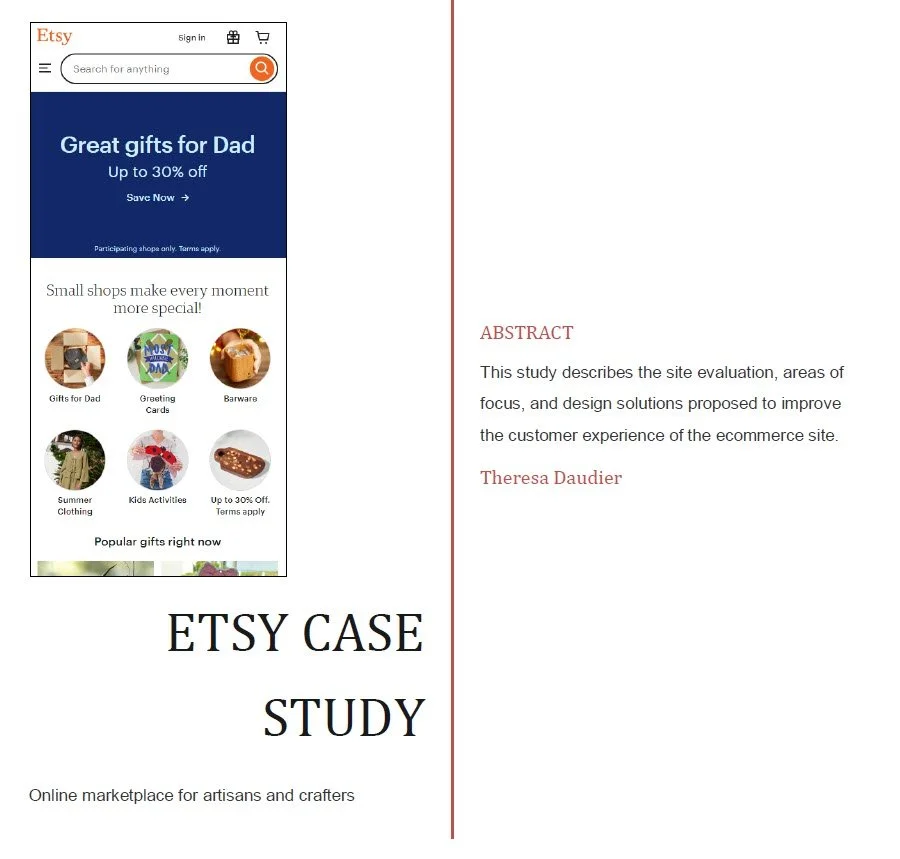
Etsy
This case study evaluates the ecommerce site etsy; an online marketplace for artisans and crafters to sell their goods through virtual shops they own.
Issues identified
Difficult to know when you are in an individual shop and not on the main site
No filters for search results in the shop pages
Misleading checkout can cause customers to purchase more than they intend
Design Solutions proposed
Apply design principles of hierarchy and dominance to make it obvious to customers when they are in shops and when they are on the main site
Enable searching within categories of shops and the same filters available on the main etsy site
Apply design principles of hierarchy and dominance to the checkout page to make it obvious to customers which items they are purchasing
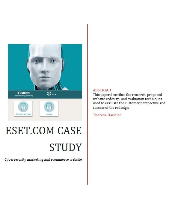
ESET
Marketing website for cybersecurity intended to:
Increase brand awareness
ecommerce
Issues identified
Stronger focus on brand awareness than on customer interaction
Customer support information is difficult to find and use
Site is not mobile-friendly
Design Solutions proposed
Redesign site to prioritize information customers are using
Change the name of the menu items to more accurately reflect the content
Redesign the mobile site to prioritize information customers are looking for and rescale to fit smaller screens